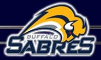
First the Sabers have dropped their Buffalo head, and even the colors of red, black and white, for the old blue and yellow and this new logo:

The new logo is of a whole buffalo (?) and looks oddly futuristic, but for some reason the logo isn't very appealing to me. I have already seen that it is being called the Buffaslug, which to me is very funny (and an accurate description of the logo). I think their old logo was much better.
The other change comes to the Mighty Ducks of Anaheim. Apparently the novelty of a professional hockey team being named after a movie has finally worn off and the team has been renamed the Anaheim Ducks, and sports this new logo:

Now, I am not crazy about text logos, but it does beat the old Disney movie logo. Also changing the colors from teal/eggplant/white to copper/black is a very good move. I still don't like the Ducks, but their prescience in the NHL doesn't induce a gag reflex from deep within me anymore. So overall this was a good change.
4 comments:
I like hockey, but it starts way too early and lasts way too long.
Don't worry you wont hear anything about it on TV until playoff times. If even then.
ha. both statements are very true.
Nooooooooooo!!!!! What about the awesome old sabre's logo?! :(
Post a Comment